Academy
FOR USERS

How to use dashboards and widgets
With Demo – Human Resource
In this academy, you’ll learn how to load data into a dashboard, drill down to connected data, and use and edit widgets.
Prerequisite:
Table of content:
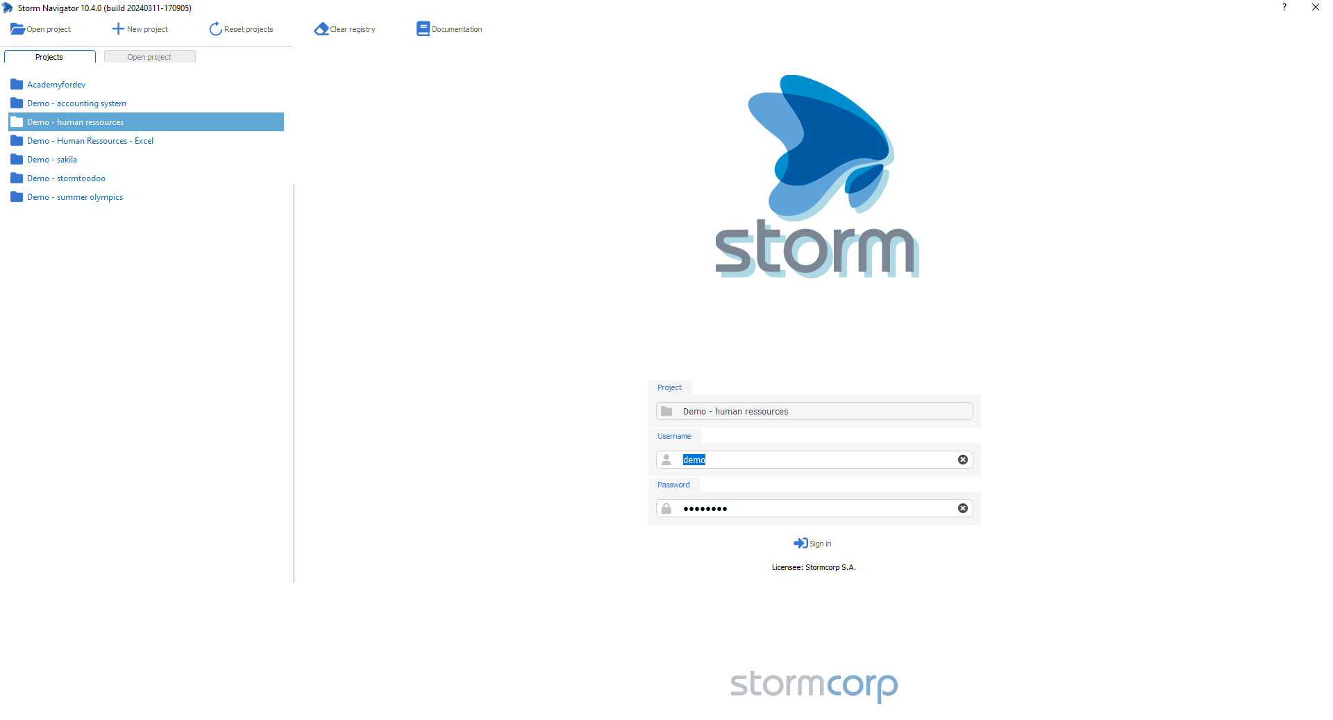
Login: displays projects where to connect
Demo projects do not require a login. You may need authorization to connect to our demo database at:
- Host: stormcorp.ch:3306
- Host: srv01.stormcorp.ch: 5432
Select your project, or one of the demo project.
Login:
- Projects: List of available projects
- Open projects: Open file explorer to select a project *.xml
- +New project: Create a new project
- Reset projects: Reset the list to project stored in \storm.project
- Clear registery: Clear all users choices
- Documention: contextual documentation
- User: User ID
- Password: Authentication password
- Sign in: Attempt to login
Steps
- Projects: select a project, for exemple Demo – Human ressources
- Enter Username and Password (not required for Demo)
- Sign in
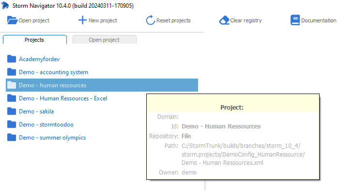
- Press shift + Roll over a project name to get the Tips
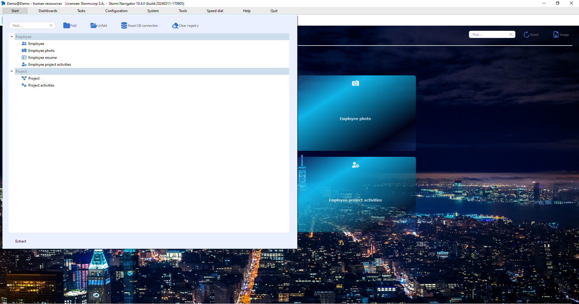
Start: display a menu with dashboards
Dashboards are assigned to a user by administrator and grouped according to business logic.
Start:
- Start: Get the drop down menu
- Arrow: Open/close a group
- Fold/Unfold: Fold/unfold all groups
- Find: Search dashboards with few characters
- Reset DB connection: Reset connection
- Clear registry: Get back Load default parameters
Click on:
- Start drop down menu
- A Dashboard name to open it
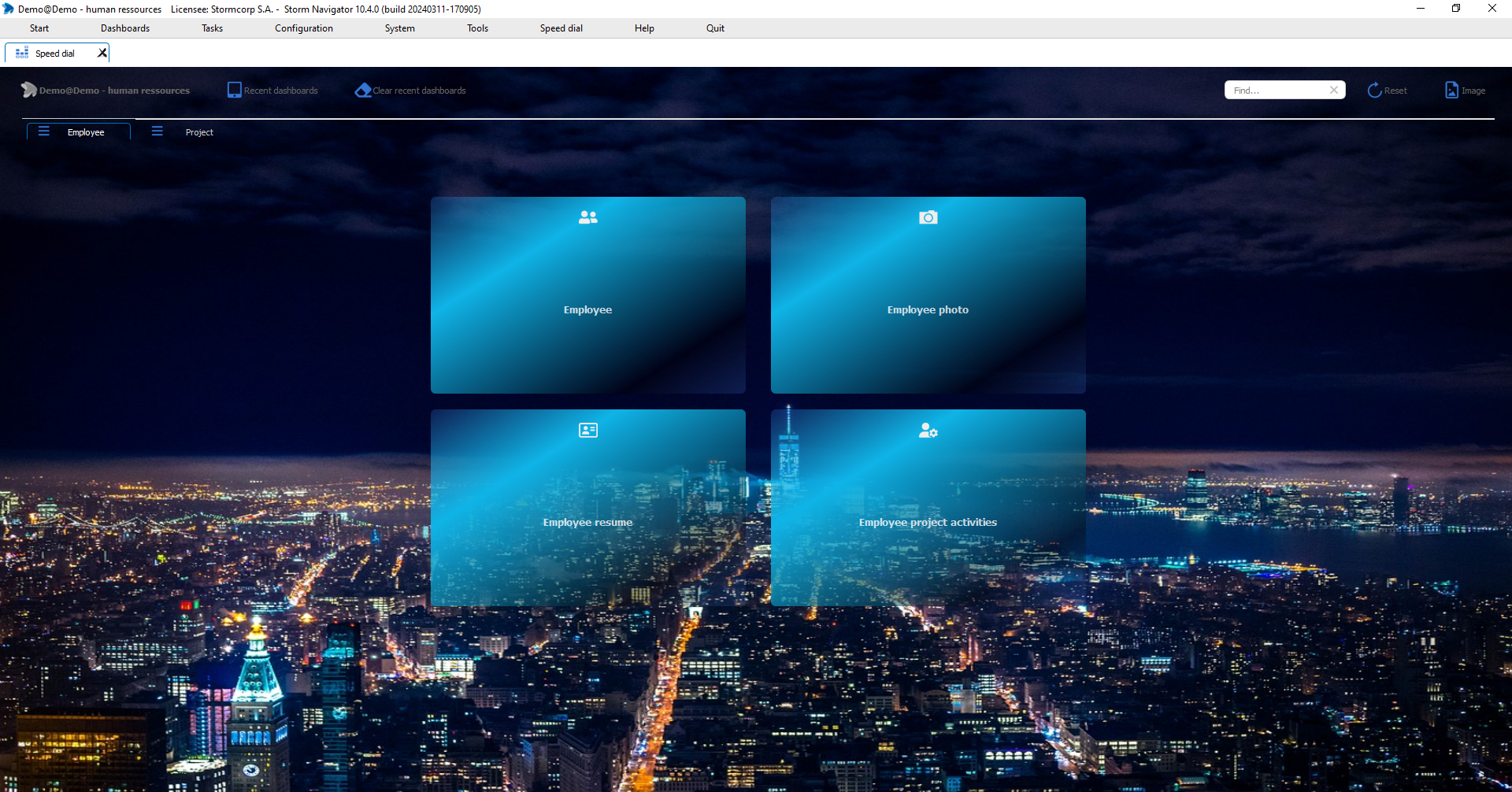
Speed dial: is a clone of Start menu
Self-service dashboards are also displayed in the corresponding tabs.
Speed dial:
- Tabs: Display dashboard according to business logic
- Recent dashboards: List of recent opened dashboards
- Clear recent dashboard: Clear the list
- Find: Search for a dashboard
- Image: To change backgroud image
Click on:
- A Dashboard name to open it
- Find: to search a dashoard
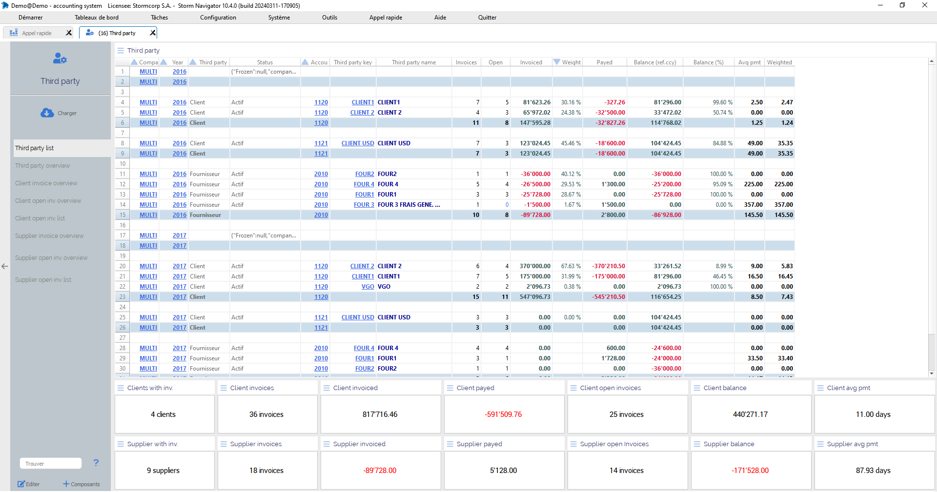
Dashboard: Multipage document displaying loaded data into widgets
A dashboard consists of a left sidebar and pages. The table of contents indicates the current page. A page displays one or more widgets.
Dashboards are available as tabs or as windows extracted by double-clicking on the tab name.
Data can be loaded on demand or automatically when the dashboard is opened.
Dashboard:
- Left side bar:
- Name: dashboard name
- Load: Load dialog
- Table of content: page navigation
- Find: Search data in widgets
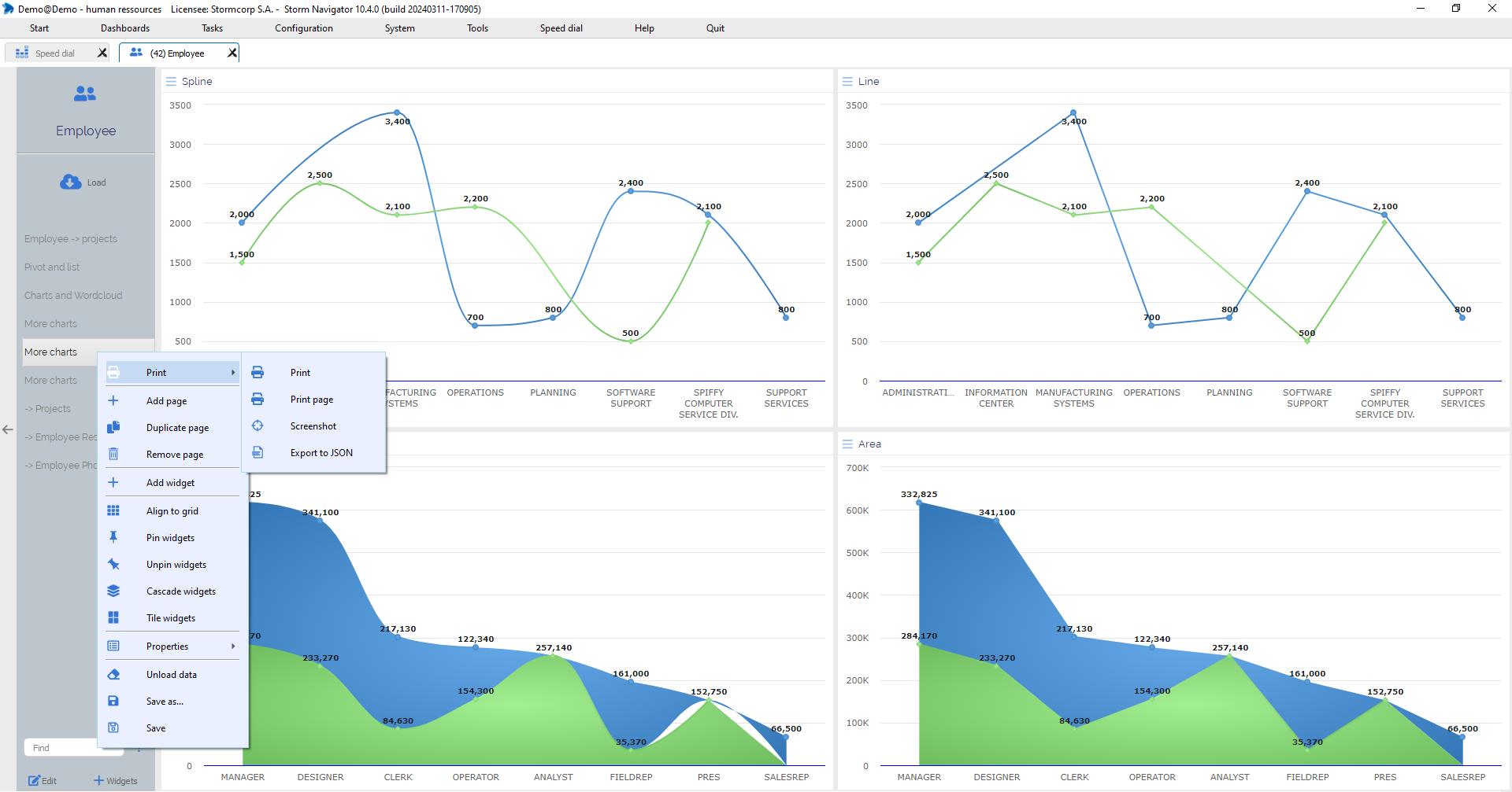
- Edit: Edit menu
- + Widgets: Add widgets
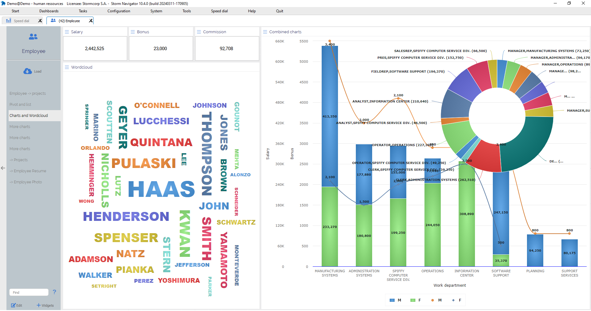
- Current page: displaying widgets with loaded data
- KPI
- List
- Pivot
- PivotList
- Chart
- …
On the left side bar, click on
- Load: Get Load dialog
- Page name: Get the page in front
Click on:
- Dashboard tab name: Get the dashboard in front
- X: Close
Double-click on
- Dashboard tab name: Extract it as separate window
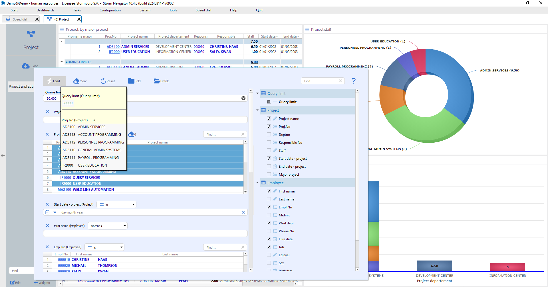
Load: Select parameter values for real-time data loading.
Parameters are grouped by underlying tables. The table name is indicated in brackets after the factor name.
A parameter is visible if it is selected from the list on the right.
Depending on the data type, a parameter can be a date, a number, a character string, one or more selected elements, possibly with a logical operator.
Tips with selected conditions appear if you move the mouse over the Load dialog button.
Based on the user’s selection, the query compiler prepares the SQL statement for real-time execution on the remote database.
Load:
- Load: Load data in real-time
- Clear: Deselect items from all parameters
- Reset: Restore default params
- Fold/Unfold: Group of params
- Find: Search through all params list
- Param scroll bar: Scroll show params
- Item scroll bar: Scroll items list
- Item selection: Ctrl-click to add or Shift-click to create a selected list since previous click
- Find: (item) Search through the list
- Logical operator: Define loading condition operator
- Date editor: Enter a valid date, manually or with calendar
- Text field: Enter a text as condition
- X: Hide a show param
Click on:
- Load icon to get the loading dialog
- List items to select them, this to define a loading condition
- Logical operator according to your needs
- Date editor to enter a valid date
- Numeric editor to enter a value
- String editor to enter a string
- Roll over Load icon, wait few seconds, to see the Tips with the conditions
- Load to execute real-time query
- Clear to Deselect all items
- Reset: Restore default params
- Anywhere outside load dialog, to close it
- Fold to hide all possible param
- Unfold to see possible param for group
- Check/uncheck a param to show it on loading possibilities
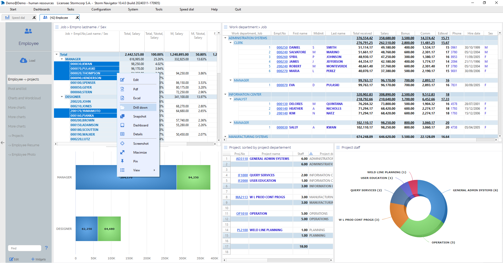
Select: Create a Context by clicking on widgets elements
The selected context will be used by the context menu and toll bar icons, such as Drill down, Snapshot, etc…
Widgets will be synchronized accordingly.
Widget:
Rows: Select one or several rows of a list
Cells: Select one or several cells of a pivot
Areas: Select one or several areas of a chart
Right-Click on:
- Row / Pivot / Chart: Get menu
Click on:
- Row: Select the row
- Pivot cell: Select the cell
- Pivot node: Select the node
- Chart area: Select chart area
Ctrl-Click on:
- Row: Add it to existing selected rows
- Pivot cell: Add it to existing selected cells
- Pivot node: Add it to existing selected nodes
- Chart area: Add it to existing selected chart areas
Shift-Click :
- Select all elements since last click
Click-Hold-Drag:
- Graphically select several items
Widget toolbar: Set of icons for data navigation, printing, resizing and copy/past, for the selected contact.
Allows you to: edit the current object, create a PDF file, export data in Excel format and navigate through data according to the selected context (Drilldown, Snapshot, Dashboard,..).
Widget toolbar
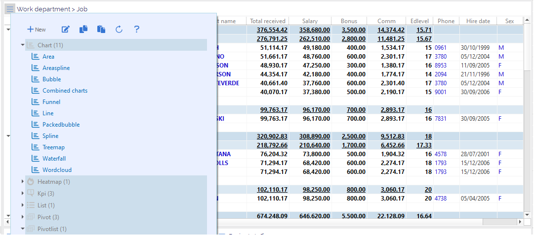
- Widget menu: (Hamburger menu) Get the list of objects to be selected
- Edit: Customize current object
- PDF: Exporting widget data into *.pdf
- Excel: Exporting widget data into *.xlsx
- Drill down: Tree with possible navigations to connected data
- Snapshot: Standalone widget with selected data
- Dashboard: Dashboard with selected data
- Details: Details windows with selected elements
- Screenshot: Copy screen to clipboard
- Maximize: Display widget in full page
- Pin: Pin / Unpin widget
- Find: Search a value
Move the mouse over:
- Widget title bar: Display toolbar
Double-click:
- Widget title bar: Maximize / unmaximize the widget size
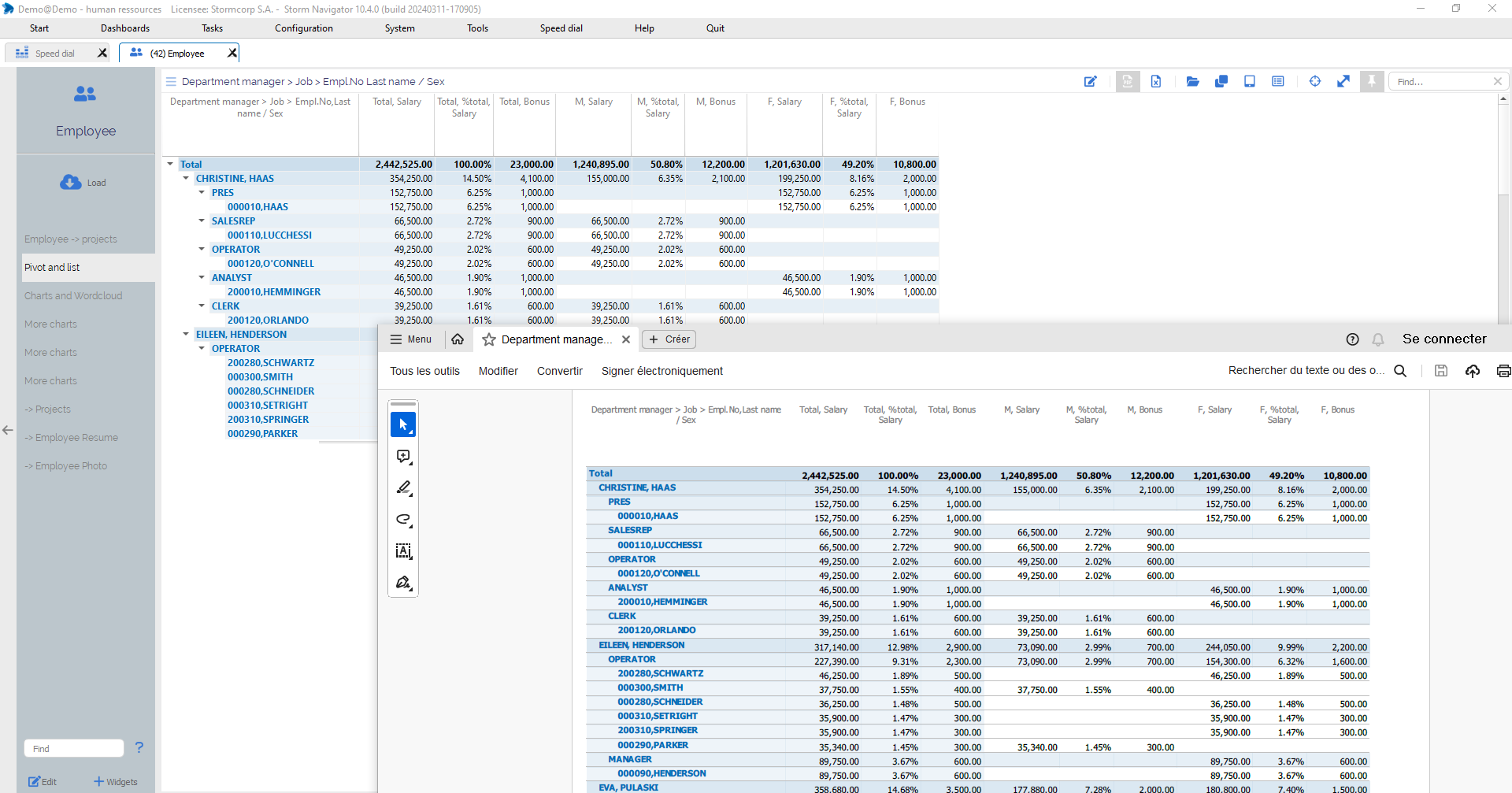
PDF: is exporting widget data into *.pdf
You will be prompted to select the target folder.
Click on:
- PDF: Select a target folder in which to create the file
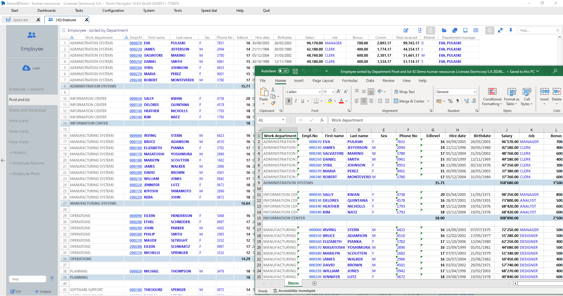
Excel: is exporting widget data into *.xlsx
You will be prompted to select the target folder.
Click on:
- Excel: Select a target folder in which to create the file
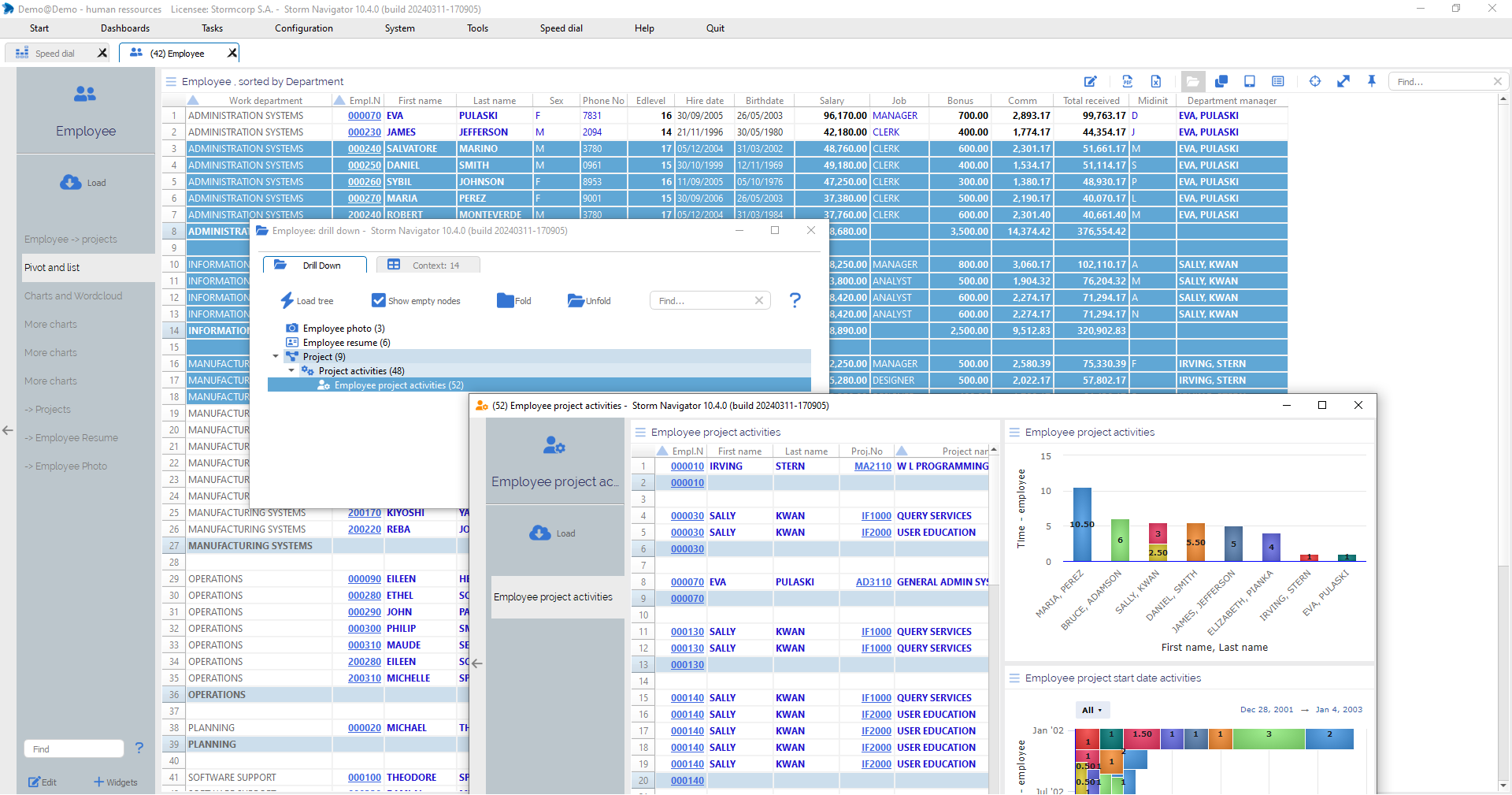
Drilldown: Tree with possible navigations to connected data.
A new dashboard will be created, with data relating to the selected context.
Click on:
- Drill down: Get tree dialog with possible connected dataset
- Node: Get the number of elements
- Load tree: Obtain the number of elements for all nodes
- Show empty node: Display nodes without elements
- Fold/Unfold: Collaps or expend tree nodes
- Context: Context elements
Double-click on:
- Node: Drill down to the connected dataset
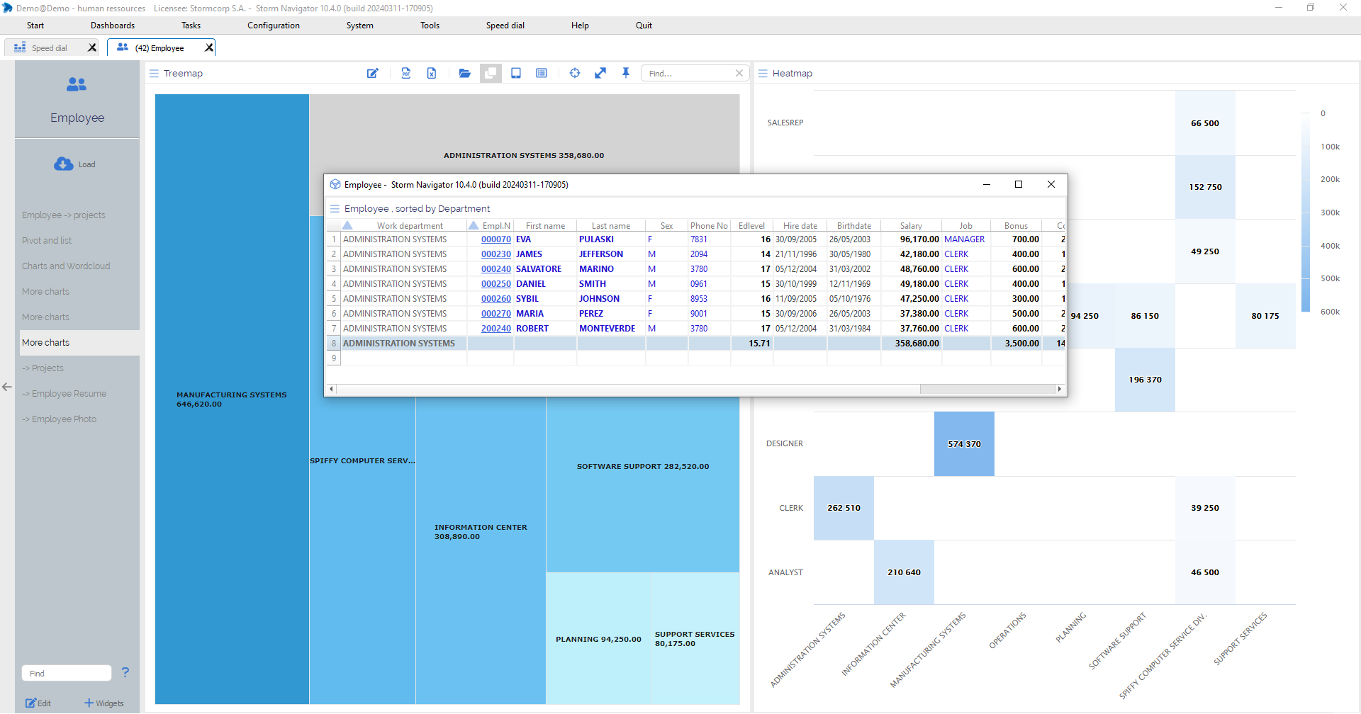
Snapshot: create a standalone widget with selected data
Thanks to the Snapshot function, data selected from a List, Pivot, Pivotlist or Chart can be sent to a new standalone widget.
Click on:
- Row / Cell / Chart: Select elements
- Snapshot: Send selected data to a new standalone widget
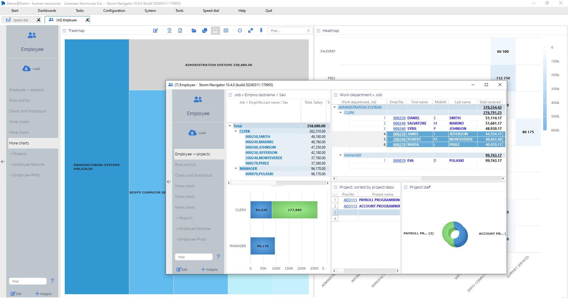
Dashboard: Create a dashboard with selected data
Thanks to the Dashboard function, data selected from a List, Pivot, Pivotlist or Chart can be sent to a new dashboard.
Click on:
- Row / Cell / Chart to select it
- Dashboard to get a new dashboard with selected element
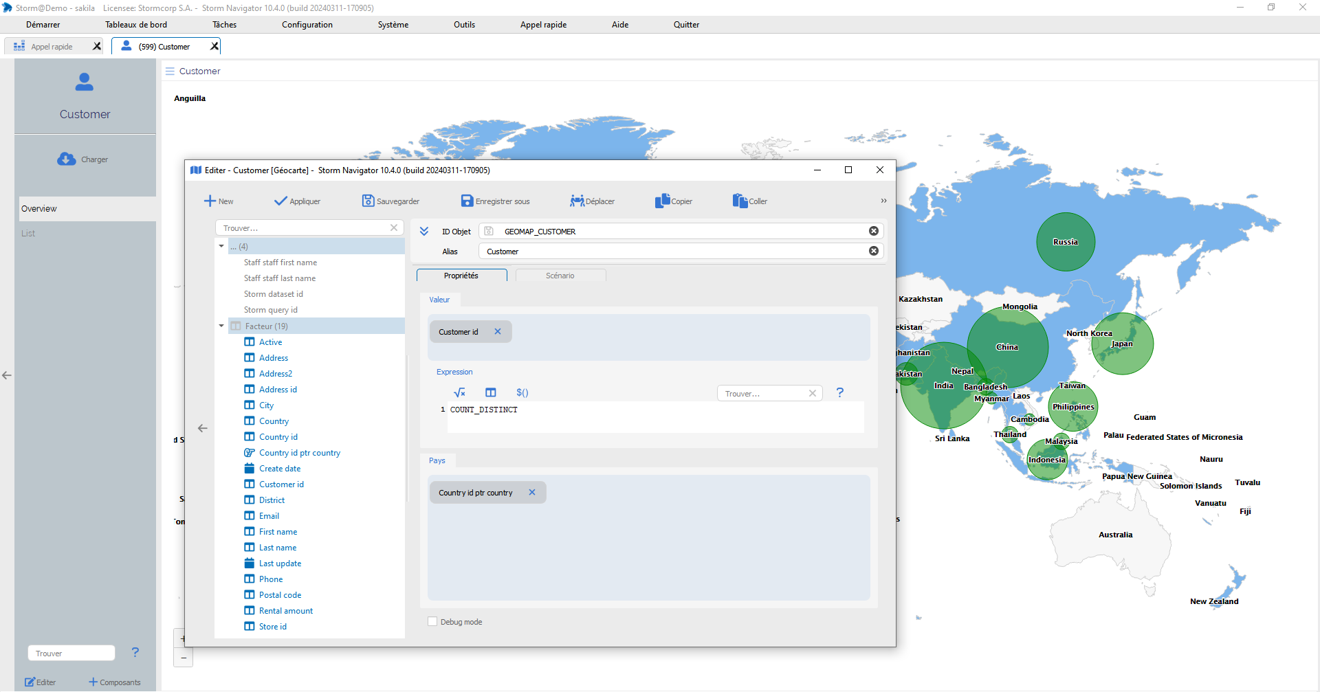
Widget editor: Features a common icon bar
Widget editor: common icon bar
- Object ID: Unique object identifier.
- Alias: Object name for user. When a new object is created, the alias is used to generate the Object ID.
- Description: Object description, displayed on the Tips.
- Parent ID: The object may belong to a dataset. It will then only be available for this data set.
- Icon: An icon can be selected.
Click on:
- +New: Create a new object, selecting type
- Apply: Apply object changes on current widget
- Save: Save object and apply changes
- Save as: Save object in a another repository
- Move: Move object in another repository
- Copy: Copy xml object
- Paste: Past xml object
- Remove: Delete object from disk
- XML: Display xml source code
- Find: Search for a factor
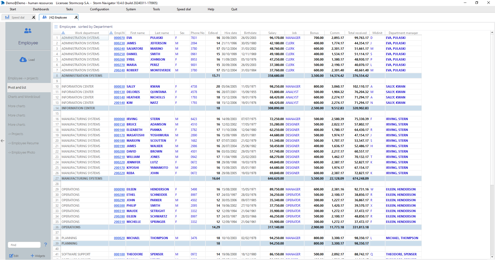
List widget: Displays data in list form, with rows, columns and a totals row.
The list displays the records (one line per record). The totals line displays totals for factors with the totals function enabled.
If the list is sorted, and the break function is activated for a factor, the contents will be repeated on the totalization line.
Click on:
- Column header: Sorting ascending, click a second time to reverse it
- Shift+Click: Sorting with totals
- Ctrl+Click: Add nested sort
- Ctrl+Shift+Click: Add nested sort, with totals
- Find:Search for string or value
Drag and Drop:
- Column header: Change sequence
Shift + mouse cursor on cell
- Tips: Display cell value
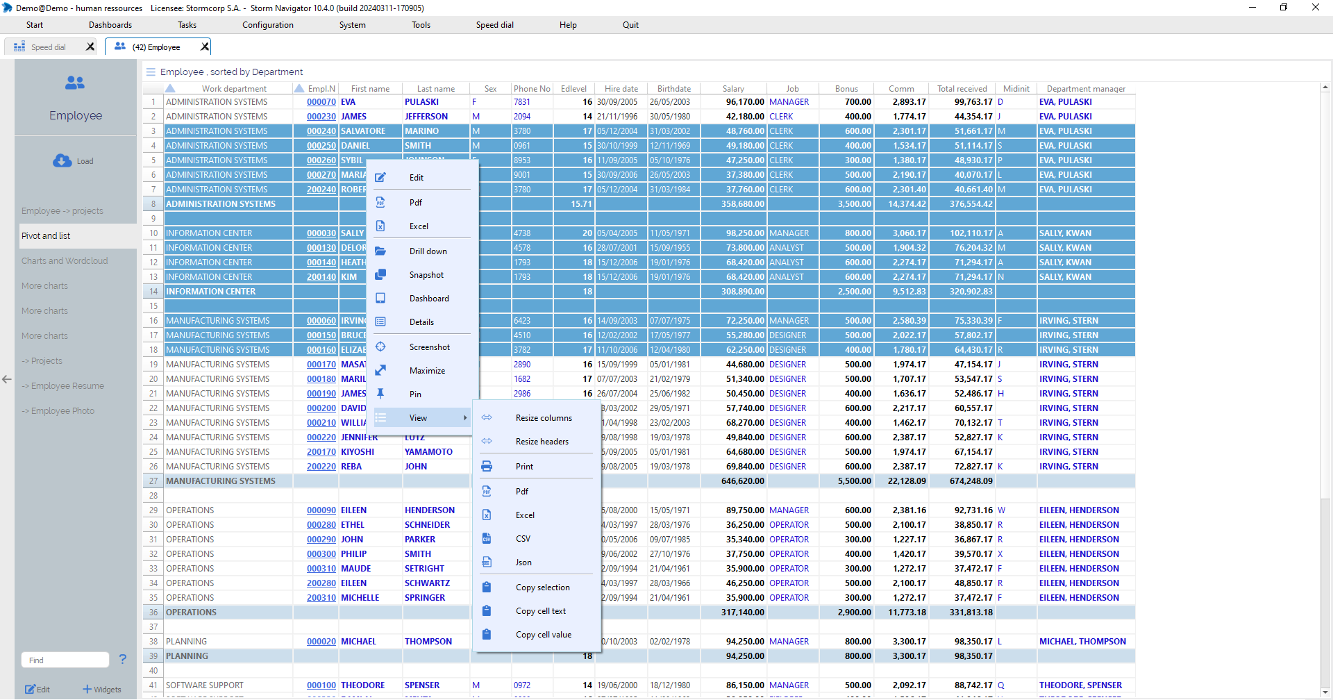
Right-click on selected area:
- Edit: Customize current object
- PDF: Exporting widget data into *.pdf
- Excel: Exporting widget data into *.xlsx
- Drill down: Tree with possible navigations to connected data
- Snapshot: Standalone widget with selected data
- Dashboard: Dashboard with selected data
- Details: Details windows with selected elements
- Screenshot: Copy screen to clipboard
- Maximize: Display widget in full page
- Pin: Pin / Unpin widget
- Find: Search a value
Additionnal possibilities:
- Resize columns: Depending on data width
- Resize header: Depending on header width
- Copy selection: Copy selected rows to clipboard
- Copy cell text: Copy selected cell text to clipboard
- Copy cell value: Cotpy selected cell value to clipboard
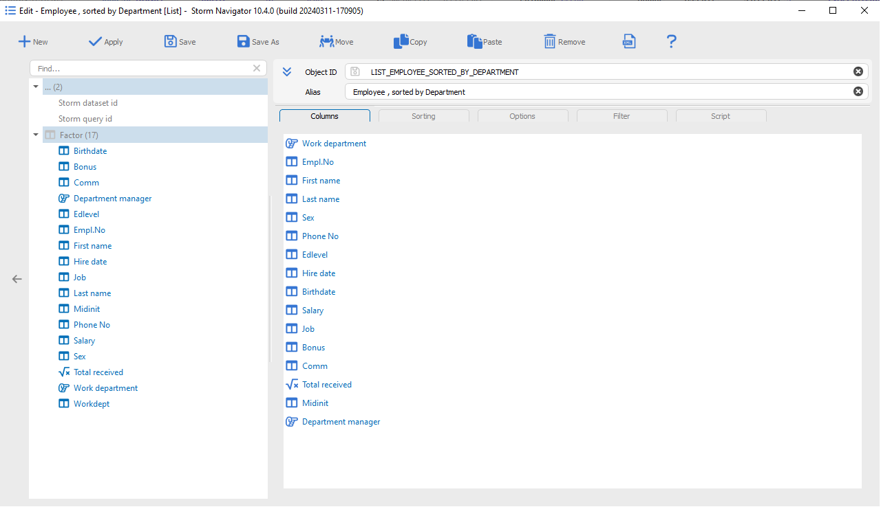
List edit: Editor of list object
Editor for defining column sequence, row sorting and totals
Factor:
- Factor: Available factors to become a visible column
Columns:
- Drag & Drop: Factor to Columns to add
- Del key: Remove a column
- Drag & Drop Up/Down: Change column sequence
Sorting:
- Sorting: Rows by columns value
- Drag & Drop Up/Down: Change sorting sequence
- Drag & Drop: Factor to Sorting to add a sort
- A0→Z9: Reverse sorting
- Sorted by code: Sorting by internal code
- Total break: Display total line
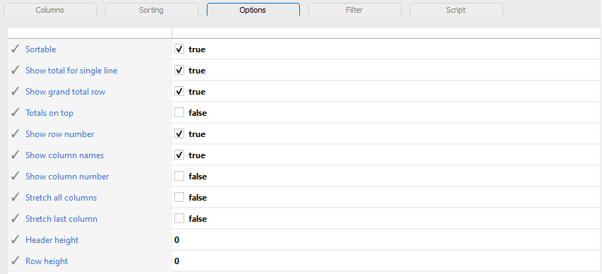
Options:
- Show total for single line: Add total also for single line
- Show grand total row: Add a grand total
- Total on top: Display total first
- Show row number: As first column
- Show column names: Display column header
- Stretch all columns: Maximize number of visible columns
- Stretch last column: On available space
- Header height: Number of line. ‘0’ provide default
- Row height: Number of line. ‘0’ provide default
Script:
- JavaScript code: Executed before visualization
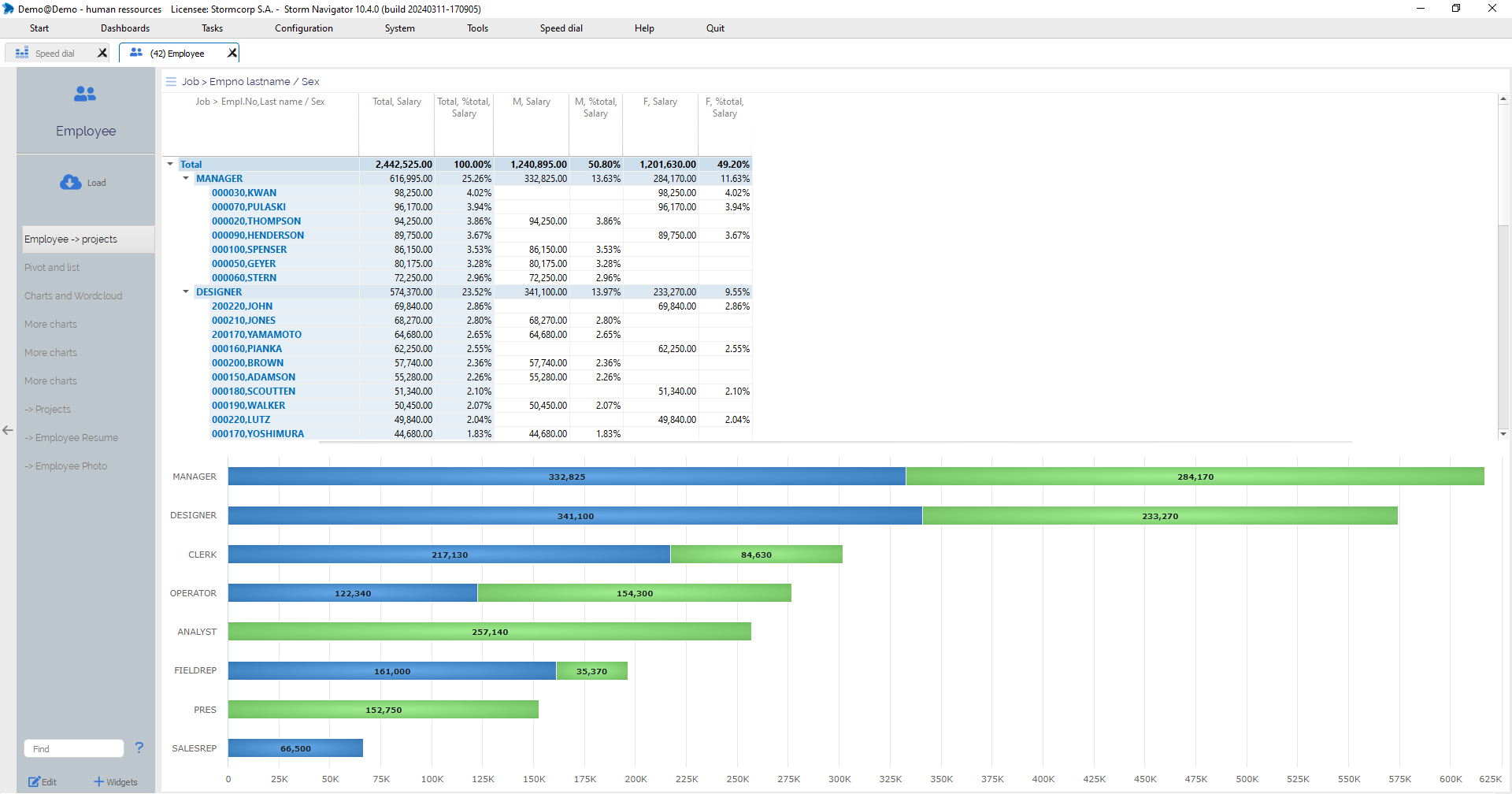
Pivot: Display values in a tree, with distributed columns and an associated chart.
Values are distributed into tree rows and columns.
A related chart can be activated.
Total row and total columns are optionnal.
It’s possible to distribute several values, for example Salary and % Total.
Click on:
- Arrow: Open/close a node
Right-click on selected area:
- Edit: Customize current object
- PDF: Exporting widget data into *.pdf
- Excel: Exporting widget data into *.xlsx
- Drill down: Tree with possible navigations to connected data
- Snapshot: Standalone widget with selected data
- Dashboard: Dashboard with selected data
- Details: Details windows with selected elements
- Screenshot: Copy screen to clipboard
- Maximize: Display widget in full page
- Pin: Pin / Unpin widget
- Find: Search a value
Additionnal possibilities:
- Resize columns: Depending on data width
- Resize header: Depending on header width
- Copy selection: Copy selected rows to clipboard
- Copy cell text: Copy selected cell text to clipboard
- Copy cell value: Cotpy selected cell value to clipboard
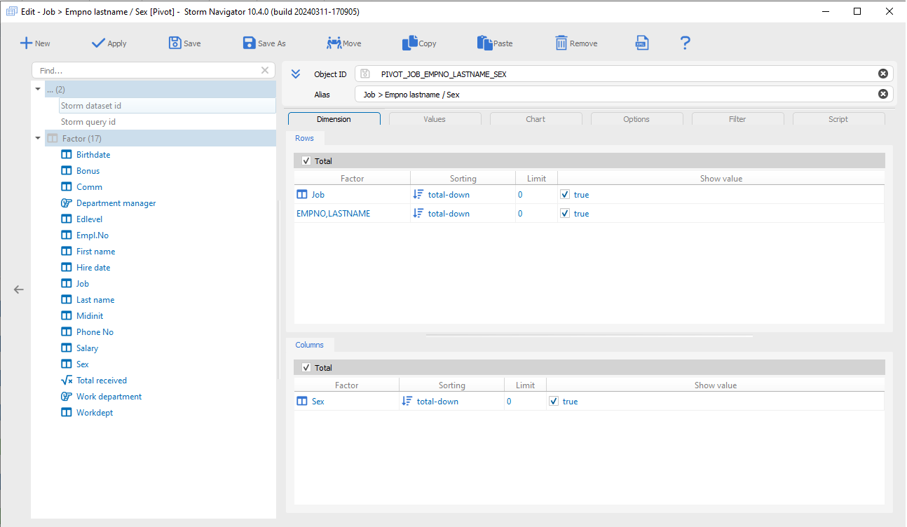
Pivot edit: Editor of pivot object
To define dimension, values and related chart.
Factor:
- Factor: Available factor to become a pivot dimensions or value
Dimensions – Rows:
- Drag & Drop: Factor to Rows to add
- Del key: Remove a row
- Drag & Drop Up/Down: Change row sequence
- Sorting: Current row by selected sort type
- Limit: Number of rows for current level. An “Other” node will group together the other
Dimensions – Columns:
- Drag & Drop: Factor to Columns to add a distributed column
- Del key: Remove a distributed column
- Drag & Drop Up/Down: Change distributed column sequence
- Sorting: Current column by selected sort type
- Limit: Number of column for current level. An “Other” node will group together the other
Values:
- Drag and Drop: Factor to Factor value to be distributed
- Alias: May override factor name
- Mode of column:
- Blank to display value
- delta from previous column
- % delta from previous column
- % Row
- % Column
- % Total
- % parent
- Show in chart: Display the value in chart
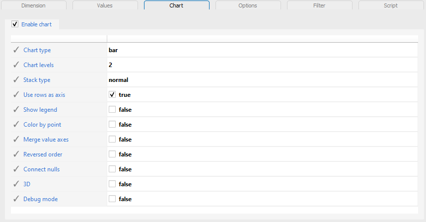
Chart:
- Enable chart: Chart pivot data
- Chart type: Type of chart
- Chart levels: Number of pivot level to chart
- Stack type:
- Blank for no stack
- normal to stack value
- percent to stack value in %
- Use rows as axis: Swap pivots axis
- Show legend: Of each category
- Color by point: One color per category
- Merge values axes: Only one axes
- Reversed order:
- Connect nulls:
- 3D:
- Debug mode:
Options:
- Tree width: Number of visible chars
- Tree name: Specific name
- Value width: Number of visible chars
- Header height: Number of rows
- Visible level: Expend tree up to
- Hide columns: Column numbers to hide
- Widget stretch:
Script:
- JavaScript code: Executed before visualization
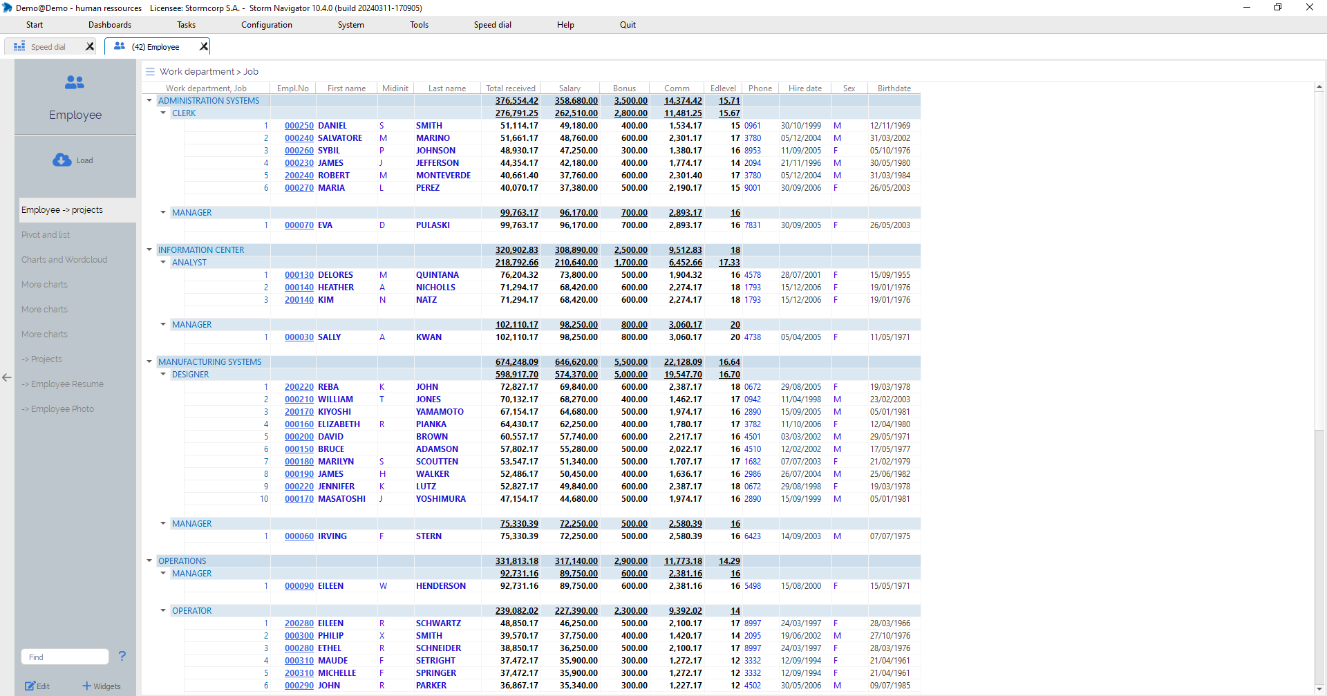
Pivotlist: Display data and values as a Pivotlist, a combination of a pivot and a list, with a tree structure, distributed columns and a connected list under each last node..
See related pivot and list explanations.
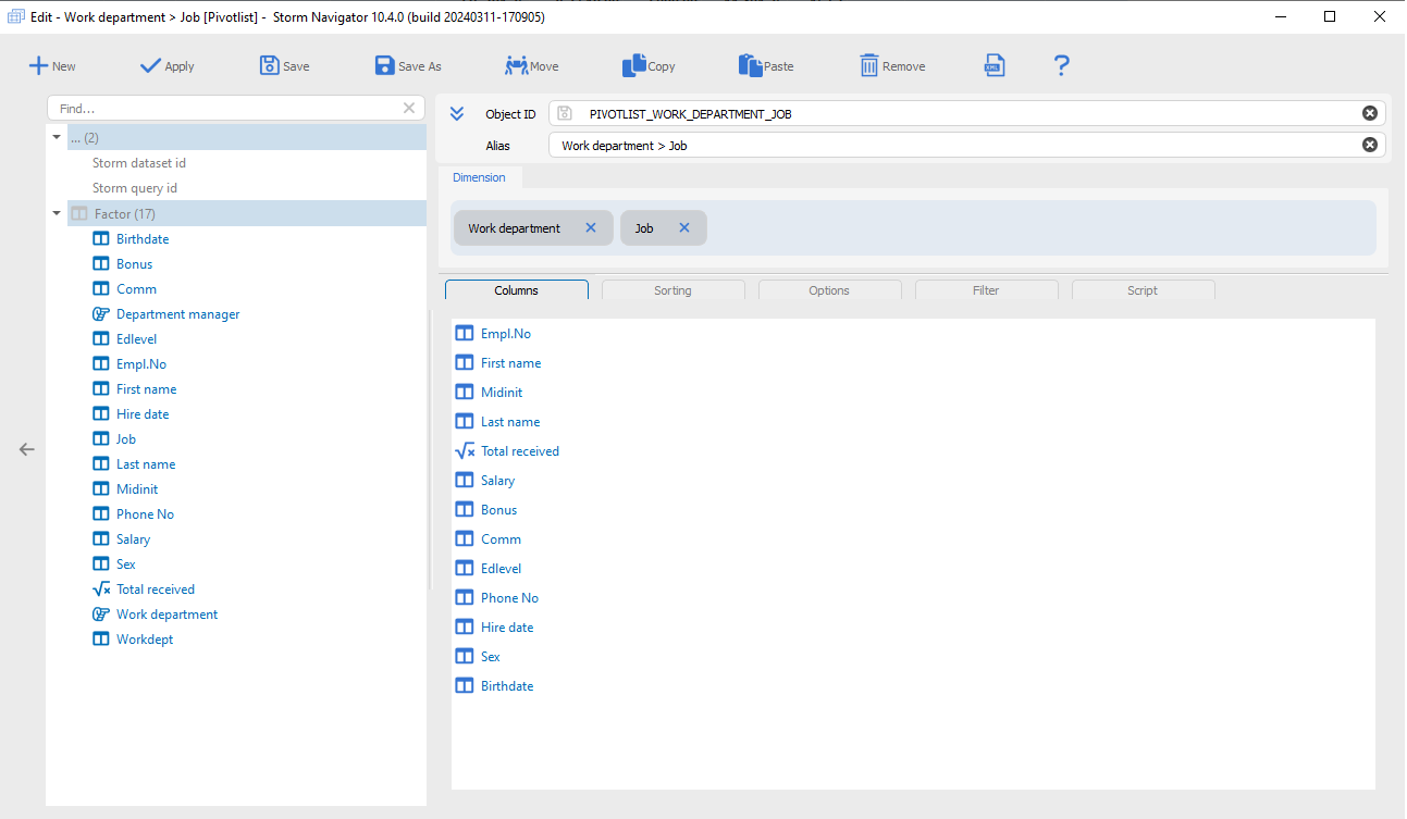
Pivotlist edit: Editor of pivotlist object
See related pivot and list explanations
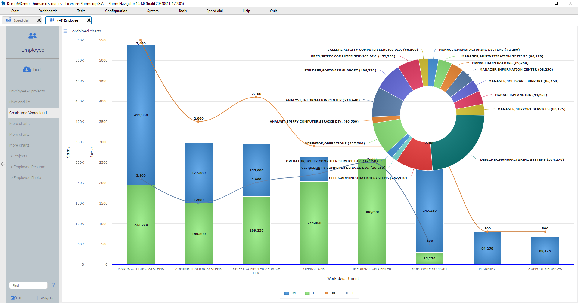
Chart: Display data as chart
May combine several charts
Click on:
- Legend to exclude related data from chart
Roll-over with the mouse:
- To get tips and to highlight area
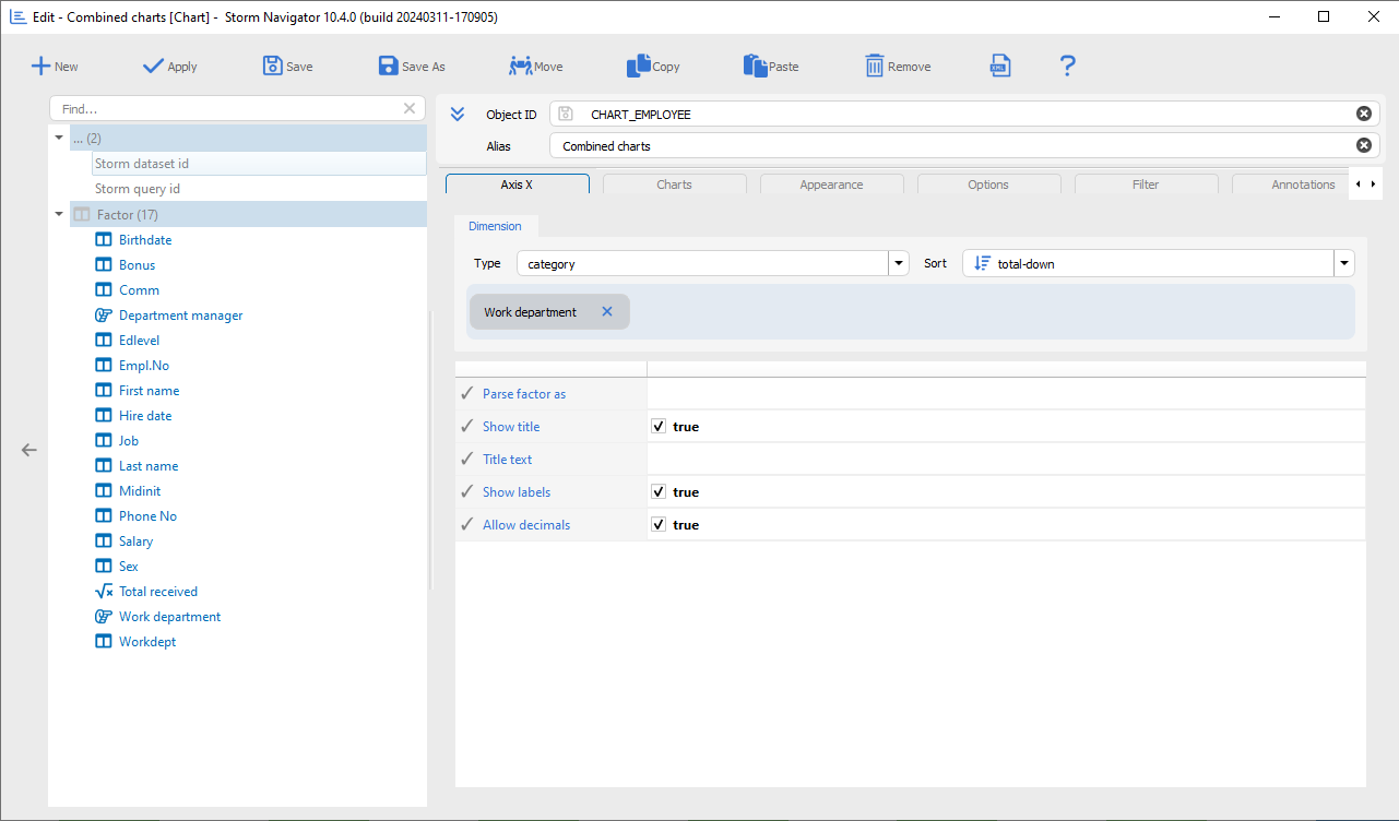
Chart Edit: Editor of chart object
Define dimension, series, appearance and options.
Factor:
- Factor: Available factor to become a chart dimensions, series or value
Axis X:
- Dimensions:
- category
- datetime
- linear
- Drag & Drop: Factor to Dimension
- Sort: Select a sort type for the X axis
- Parse factor as: Double click to get the list
- Show title: Dimension factor will be display
- Title text: Specific text title
- Show labels: category
- Allow decimals:
Charts:
- +Add: Add a new type of chart
- Drag & Drop: Factor to Value
- Drag & Drop: Factor to Split
- <chart>: Chart editor
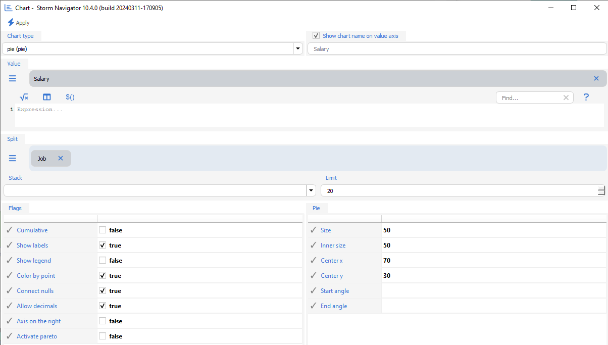
Chart editor
- Chart type: Type of chart
- Show chart name on value axis: Specific text
- Value: Factor value to chart
Split
- Split: Split factor
- Stack:
- blank for no stack
- normal to stack value
- percent to value in %
- Limit: Number of category. An “Other” node will group together the other
Flag:
- Cumulative:
- Show labels:
- Show legend: Of each category
- Color by point: One color per category
- Connect nulls:
- Allow decimals:
- Axis on the right: Left is default
- Activate pareto:
Pie:
- Size:
- Inner size:
- Center X:
- Center Y:
- Start angle:
- End angle:
Appearance:
- Title
- Layout
- Align
- Vertical align
Options:
- Merge values axes
- Reversed order
- Date range selector
- Rotate chart
- Show model
- Debug mode
Annotation:
- See example
Script:
- JavaScript code: Executed before visualization
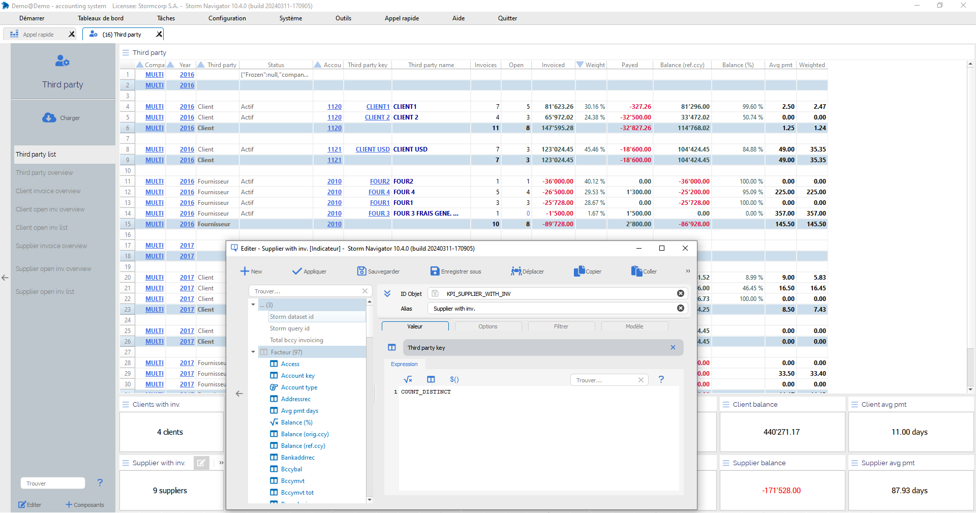
KPI Edit: Editor of KPI object
To define a KPI
Value:
Factor: to be displayed as a KPI
Expression: Function or Javascript code
Options:
Style:
Smart formatting:
Format:
Left pad:
Right pad:
Background:
Foreground:
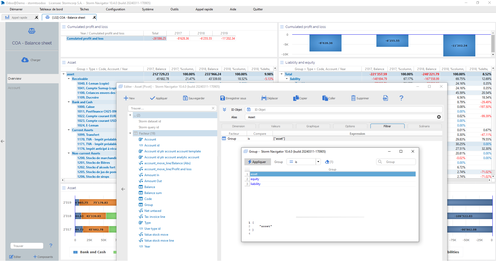
Filter: loaded data are filtered at widget level
Filter:
- Factor: to filter data on this widget
- Compare: logical operator
- Expression: list of values
Double-click on:
- Compare: get the list of operator
- Expression: to get the list of possible values
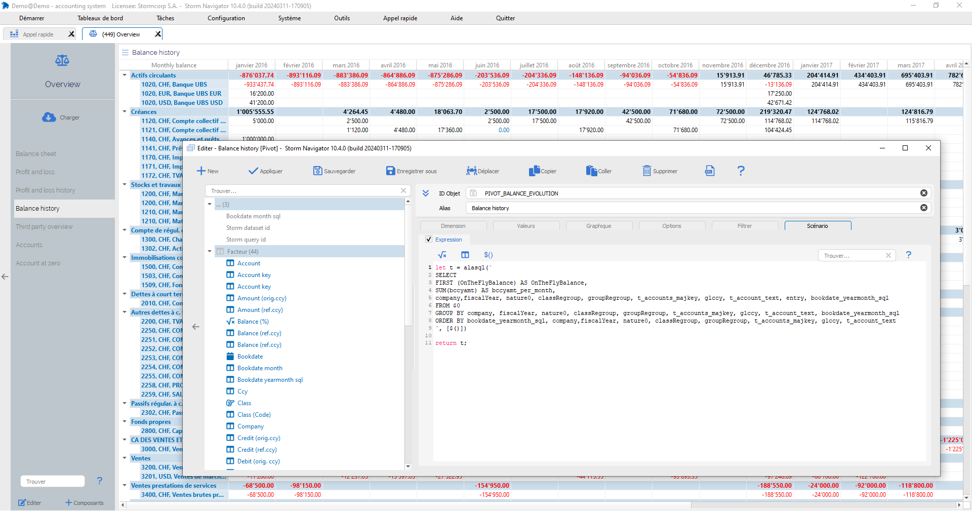
Script: Executed before data visualisation
In this Demo – StormToOdoo, this widget is calling AlaSQL to display the last movement of each months.
Script:
- JavaScript code: Executed before visualization

